
Conceptual Client: Wild Orchard Brew
Year: 2025
Services provided: Logo and Branding, Packaging, Video
Wild Orchard Brew is a conceptual cider brand created from a brief by @briefclub, which asked for a logo, packaging design, and a cohesive brand identity that captures the spirit of nature and craftsmanship.
The brand takes inspiration from orchard life and the simple beauty of a hand-picked apple. The color palette draws from the three core apple varieties — yellow, green, and red — which also define the flavor variations across the line. Hand-drawn illustrations add a rustic and personal touch, reinforcing the handcrafted essence behind the brew.
The result is a warm and inviting identity built around a refined wordmark, textured packaging, and organic visuals that bring the orchard to life. Wild Orchard Brew shows how thoughtful design and storytelling can turn a humble cider into a complete and memorable brand experience.
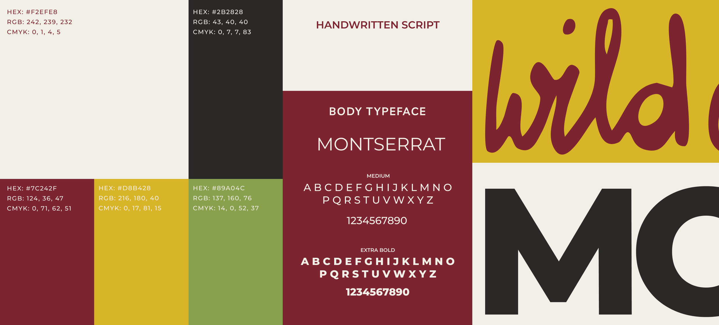
The visual language of Wild Orchard Brew was built around earthy tones, natural textures, and a sense of handcrafted warmth that reflects the care behind each cider. The color palette features slightly muted shades of red, yellow, and green, inspired by the orchard and its apples. These tones feel grounded and authentic, bringing an organic contrast that runs throughout the brand. Soft beige tones help the colors blend harmoniously, while soft blacks are used flexibly across applications to support clarity and balance.
Typography plays a key role in defining the brand’s personality. A custom handwritten script font gives the identity its unique, crafted feel, paired with the clean and readable Montserrat typeface for supporting text. Together, they create a look that feels approachable, honest, and timeless.
Combined, the warm colors, natural textures, and thoughtful typography form a cohesive identity that captures the spirit of Wild Orchard Brew, a brand rooted in nature, craft, and authenticity.

For Wild Orchard Brew, I created a series of hand-drawn illustrations to represent each flavor variation, adding a playful and story-driven layer to the brand. The yellow flavor, Honey Drop, shows bees buzzing gently around the apples while curious ducks try to nibble on the ones they can reach. Morning Dew, in green, captures the calm of sunrise over the orchard, with ducks wandering between the trees and glistening apples. The red variation, Rogue, brings the story full circle, showing the ducks finally reaching the apples themselves.
In addition to the flavor illustrations, I developed a custom pattern featuring apples, bees, ducks, the logo, and key typography elements. This pattern expands the brand world across packaging, merchandise, and collateral, reinforcing the handcrafted feel while creating visual consistency throughout every touchpoint.
Together, these illustrations and patterns add warmth, charm, and depth to Wild Orchard Brew, turning each flavor into its own orchard story and celebrating the brand’s connection to nature and craft.


Sometimes it’s the feeling that makes a brand memorable. For Wild Orchard Brew, I created a short commercial clip that captures the spirit behind the cider and the process that brings it to life. The film offers a glimpse behind the scenes, from the orchard and the handpicked apples to the moment the can is cracked open and poured. It is a simple yet immersive story about craft, care, and the untamed beauty that defines the brand.
This piece embodies how Wild Orchard Brew should make you feel: grounded, refreshed, and connected to something honest and wild. If you want to see a social media version, feel free to check out my Instagram @katrinhoeller_design.